


Here’s another image where I’ve used textures with a normal blend mode to “paint” in areas of a photograph.
This is a half example/half tutorial. It is intermediate – advanced level and assumes you have basic Photoshop or Elements skills and a basic understanding of using textures.

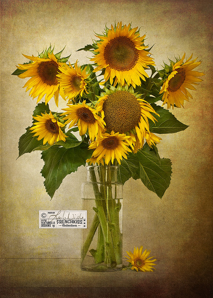
Photograph Details:
- Photograph: © 2010, Leslie Nicole
- Camera: Canon 40D
- Lens: Canon 60mm macro
- Settings: ISO 100, f/11, .5 sec.
- Tripod, mirror lock-up, shutter release cable.
- Natural light. Windows and skylight.
- Post-Processing: Topaz Labs* Detail filter.
Paint With Textures
Textures aren’t just for adding—well, texture. They can also be used to refine and expand the original photograph. When I photograph a still life, I want the table top and backdrop to be a background that blends together in harmony. I have a tiny shooting studio and pretty much use the same counter to photograph on. My backdrops are often a piece of foam core. By using textures, I can transform my plain, hard-edged, white counter to something soft, weathered and muted.
Below is a detailed area showing the table top and the foam core backdrop for this still life. I’ll almost always “paint” in areas that I don’t want showing and to diminish the line where the backdrop meets the table top.
- Duplicate the main texture. Command (Mac) + J or Control (PC) +J. I’ll sometimes do this with several textures.
- Set the duplicated texture to the normal blend mode.
- Add a layer mask filled with black. (If you hold down option (Mac) or alt (PC) when you click the New Layer icon, it will be filled with black. Note: if you have a layer mask already then fill it with black.
- Use the Brush Tool with the foreground set to white to paint in the areas on the layer mask that you wish to fill in, diminish or blend.

The Photoshop Layer Panel
Below is the Photoshop layer panel for this image with details written on each layer panel for: Texture and Texture collections, Blend Modes, Opacities, and Layer Masks.
Special Notes:
- Two layers use the Normal blend mode. The main texture, Vintage Clouds, which fills in the blank areas and fades areas. Look closely at the layer mask and you’ll see the white areas at the bottom where this texture is used to “paint” over areas. I also used a darker texture, Bibliotheque to create a deeper vignette around the image. You can see in the example above how much texture is over the vase, stems and flower.
- Notice how none of the layer masks has completely masked the flowers and vase. I get a lot of questions about how I mask the flowers. I only rarely completely mask something. If you use the right textures and blend modes, they will work in harmony with your image and the texture becomes part of the image. See image below the layer mask.

Layer Masks
As indicated above in the layer panel description, the flowers and vase are not completely masked. I will clean off the flowers enough so they don’t look dirty, but I rarely completely mask them. Your image will look more natural if it is blended with your textures rather than cut out and appearing to sit on top. There are times when I will do a lot more masking, but it’s very, very rare that I’ll do a complete masking of my main object in the photograph. Sometimes, when I want a pretty clean mask, I’ll completely mask the object and then go back in with a large, soft brush set to white and very gradually, at very low opacities, add back some texture to the edges so that it is better blended.

Feedback Welcome
Sometimes, I choose to illustrate certain key insights in a Before and After tutorial rather than a step-by-step. Let me know in the comments if this is enough information and if you find seeing the layer mask with notes sufficient to understand what’s happening. Keep in mind, this particular example isn’t geared towards beginners. It assumes that you have a working knowledge of Photoshop and Elements.
Resources:
Topaz Labs* Detail filter. This is an affiliate link. I get a small commission from any sales resulting from a click from this site (at no extra cost to you.) I really do love these filters. Nearly all of my own images use one of these filters. Thank you for supporting the site!
French Kiss Fine Art Textures
Texture collections used in this tutorial.


Thank you Leslie ! Wonderful tutorials !
Thanks for a really fine tutorial outlining the details and how things come together
Could you comment on how/why you choose the textures you do? you used 6 here - what’s behind the decisions? I always struggle trying to develop a good textured image - thoughts??
Hello Steve,
It’s a good question and maybe a little hard to answer in a comment reply. That crossed my mind as I was doing the tut. Perhaps I should go back in and add in some details about that. One thing to remember is that I didn’t start out thinking I’d use 6 textures. The steps grow as I work and sometimes when you look back on it at the end, it’s possible that I didn’t actually need 6 - some are used just barely, but that’s the way it grew. Working with textures is something that is always an experimental journey, but it does get easier as you do it more. I tend to first consider color. What will either work in harmony or create a pleasing contrast with my subject. Then I might pick textures that allow me to add edge interest or a texture that lightens or darkens and/or gives a slight overall color cast. I’ll try to go in and expand upon the tut—but I’ll probably be too busy this week to do it. Thanks for your question!
Bit by bit and very slowly I’m starting to understand the workflow for using textures. Learning Photoshop aswell makes it all head-wrecking. But your work is lovely and the Tutorials make sense so I’m going to persevere! Well done.
Thank you, Sara!
I, for one, certainly need more of a step by step tut. I know PS pretty well and working with layers. Just need more of the process than just the screen shot. Maybe I’m in the minority. I do so appreciate your artistic talent and willingness to share your tuts. thank you, susan
Appreciate your feedback Susan.
The layers screenshot is very informative and when I spend time studying it, I see the process clearly and understand the concepts. I do have one question. There’s a Burn/Dodge Overlay layer (third from the bottom) which I assume is filled with 50% gray. What is that used for and was it used at all on this image? Thanks!
Hi Vivian,
Yes, if the burn/dodge layer is there - it was used. I need to do a whole post on this! This layer is set to a blend mode of overlay (or soft light for a more subtle effect) Overlay is one of the contrast layers. It doesn’t “see” 50% gray. The gray is only there to be easier for me to see. (I got this tip from Matt Kloskowski in his fabulous book on layers.) You can “burn” with black and “dodge” with white. This works much better than the Photoshop burn/dodge tools.