
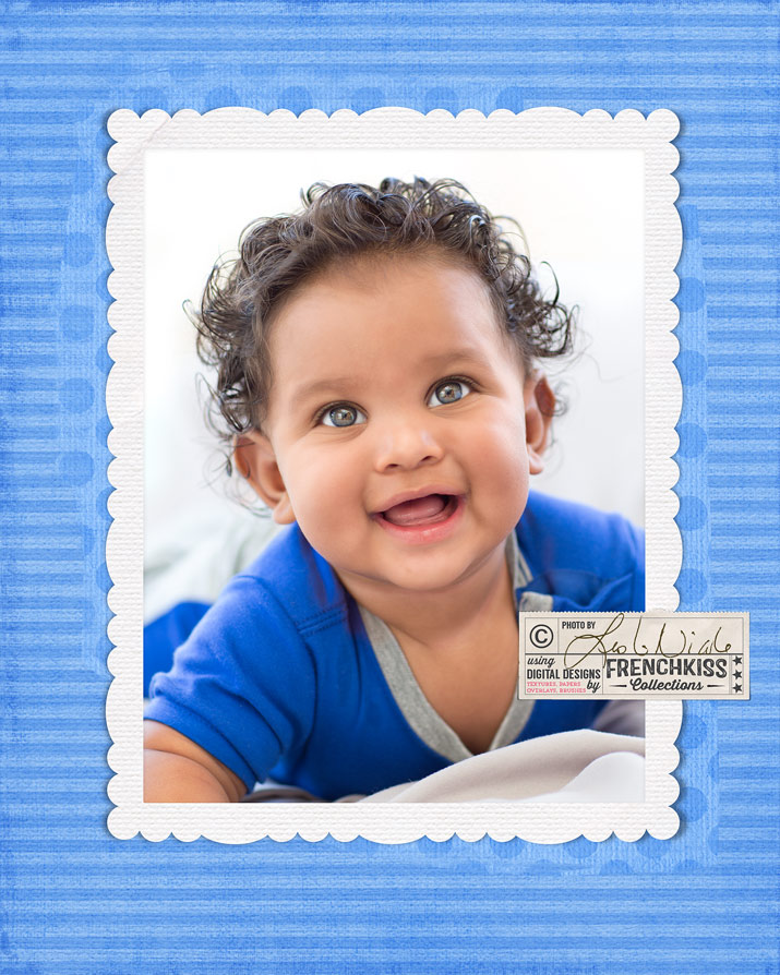
My latest digital paper release, Love Ya was inspired by Valentine’s Day, so it’s very pinkalicious. Just because it’s a girly color though doesn’t mean we have to use it that way. I’ve used a striped paper and frame for this portrait of a baby boy. 5D MK III, 85mm 1.2, ISO 250, f/2.5, 1/125.
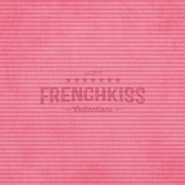
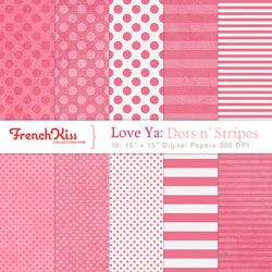
I took a paper from the Love Ya: Dots n’ Stripes collection.
Plus a frame mat element from the Love Ya Elements collection:
Then, I simply added a Hue /Saturation Adjustment layer and slid the hue to -134.
- This color change was pretty straight forward, but often colors can go rather neon when you make a hue change. When this happens, use the saturation slider to desaturate the color. If there are multiple colors in the image you want to change, but you just want to adjust one color, then use the drop-down menu that says Master to find the color you want to adjust.
- I rarely use the Lightness slider to adjust the brightness and contrast. Instead, I will add use a separate Levels or Curves adjustment.
- To fine-tune a color after you’ve used the Hue/Adjustment, add a Color Balance adjustment layer.
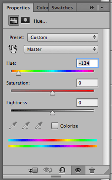
Hue / Saturation adjustment
Finally, here is a peek at the Layer Panel for the image.
If you need any help knowing how to use photo frames see this video tutorial.

Resources
- Frame & Photo Mat: Love Ya Elements collection.
- Digital Paper: Love Ya: Dots n’ Stripes collection.
- Get the Love Ya bundle (includes more paper collections) and save.


American Photographer and Designer living in France with my French husband, 2 Weimaraners and Cat Rescues. Camera, Mac, studio, garden.
