


With some textured images, you need to push and pull to get them the way you want. I photographed this lovely Ranunculus from my garden against a plain white background. I’ve played with this image for 2 years now trying to find the right texture for it. All the textures I tried were either too plain or too distracting to the flower. It’s too bad I didn’t save those early attempts to show you how blah to downright bad they were!
Original Image
Below is the original image with just a levels adjustment.
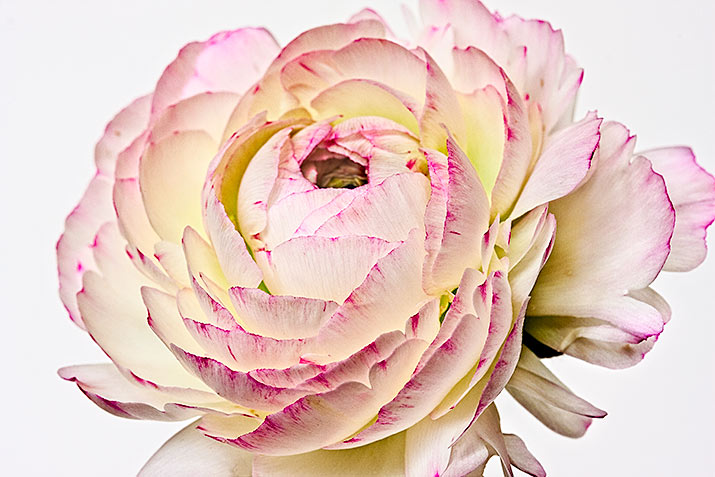
Original Image
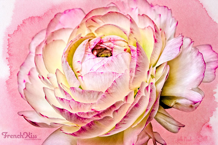
Original With Post-Processing
To increase the detail and contrast, I ran the Topaz Lab’s Clarity* filter (Nature / Macro II setting). I wanted to take off some of the sharpness of the grain / photographic feeling of the image, so I then applied the Photoshop (CC & CS6) Oil Paint filter (Pixel Bender for CS5). Tip: slide the “shine” setting to zero. I find I always need to run the Topaz Labs’ Detail 3* filter when I use the Oil Paint filter. (Setting: Overall / Detail Light II.) I ended up pulling the opacity of the Oil Paint plus Topaz Labs’ Detail 3* filter layer to only 37%. I wanted the flower to pop more, so I pulled yellow out of the highlights with a levels adjustment layer. I am getting a blue cast in the background, but once I add the texture, this doesn’t matter.

With Topaz filters, additional levels and burn & dodge.
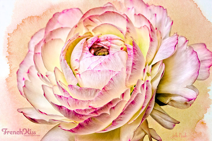
Watercolor Texture Added
I liked the way the watercolor texture, Rose Petal, from the French Kiss Collection, Autumn Rain, mimics the petal edges. It also keeps the light, airy feeling of the image. See in the layer panel below that I also used a layer mask on the texture to remove the texture from the flower. The texture was set to a Blend Mode of Multiply at 100% Opacity.
French Kiss Collections Watercolor texture added.
Watercolor Texture Hue Tweaked
While an argument can be made for the flower standing out nicely against the darker pink background of the texture, I wanted the appearance of the texture being an extension of the petals. First, I tweaked the hue of the texture. I used a hue/saturation adjustment level with a clipping mask to change the color. (See Tut)
Texture with a hue/saturation adjustment.
Next, I used the layer mask on the hue / saturation adjustment layer to paint back the pink of the texture on the edges to mimic the flower petals. I also added a levels adjustment layer to increase the contrast of the texture and bring the pinks closer to the magenta in the flower.

Layer mask of the hue/saturation adjustment layer selectively masked.
Texture Duplicated And Set To Normal
I wanted some of the back petals to bleed into the texture more, so I grouped the texture and it’s adjustment layers and then duplicated the group and set the texture’s Blend Mode to Normal and the Opacity at 70%. I then painted the layer mask with white on some petals to bring back the texture. Because the texture’s blend mode is normal, the petals get covered up with the texture. Note: I used low opacities and built up the effect. Note: with Photoshop Elements, you may not be able to group the texture layers and still edit them. Just duplicate all the layers.

Duplicated Texture and texture adjustments set to Blend Mode: Normal, 70% Opacity
Final Adjustments
If I were doing a painting, I would use different colors in the shadows and highlights. They wouldn’t just be gray or white. First, I used another burn/dodge layer to lighten selective areas. I then used the paint brush to add pinks, blues, purples and greens at different opacities and different blend modes to give just a little more of a painterly feel to the image. Here’s the final again. It’s a very subtle change, but it’s a little more painterly. Note: I’ll do a tutorial on using Burn/Dodge Overlay layers and painting with colors in a future tutorial.
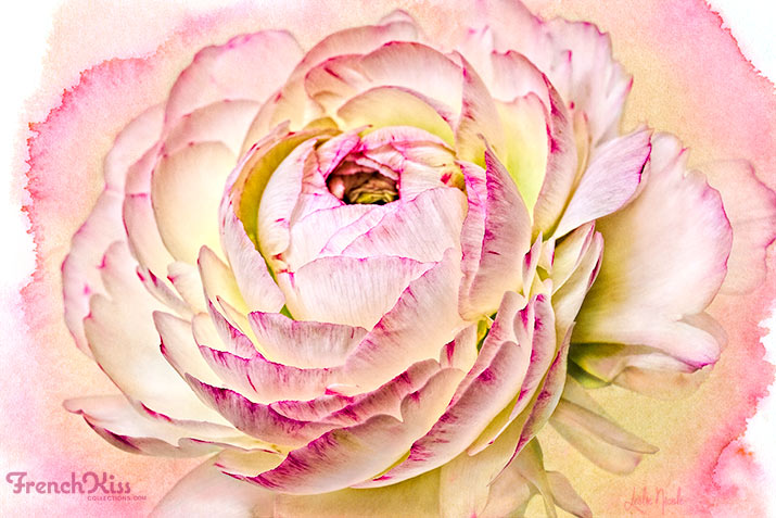
Final Image again.
The Layer Panel
Here’s a peek at my layer panel!
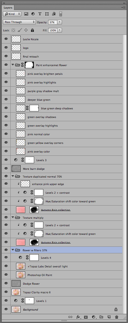
The Photoshop Layer Panel.
Resources
- Topaz Labs’ Clarity filter*
- Topaz Labs’ Detail 3 filter*
- French Kiss Collections’ Autumn Rain Collection
* Topaz Labs Filters is an affiliate link. I get a small commission from any sales resulting from a click from this site (at no extra cost to you.) I really do love these filters. Nearly all of my own images use one of these filters. Thank you for supporting the site.

American Photographer and Designer living in France with my French husband, 2 Weimaraners and Cat Rescues. Camera, Mac, studio, garden.

The picture looks really great.
Thank you very much for showing us how you did this.
Dominik
Dominik recently posted..Zeichenstift-Werkzeug – Bilder freistellen in Photoshop
another amazing image – thank you for taking the time to inspire us.
Thanks Leslie, this is a wonderful tutorial!!!