
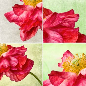

Here is one photograph with four different textured looks. Sometimes, I know right away what texture to use with a photograph, but often, I try several different approaches to see which works best. Usually, one direction will be the clear winner, but occasionally, I just can’t decide!
The Image: A Red Double Poppy
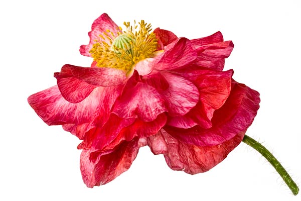
Mouse over to see the original image.
Photoshop Post-Processing Steps
Base Edits
I thought this image had a lot of potential, but straight out of the camera it’s a bit listless. (Frankly, most images “SOC” need a little love.)
- Levels adjustment layer to add contrast.
- A burn / dodge layer to dodge the highlight edges a bit to increase the dimensionality in the layered petals.
- Cloning to clean up any dirt specks, etc.
Photoshop Filters
- Topaz Labs Filter Adjust / Exposure Adjustment. I don’t always use this filter, but sometimes it does a really nice job.
- Pixel Bender / Oil Paint. (Free. CS5 only) I love this filter. It gives me clean edges and a painterly feel.
- Topaz Labs Filter Detail. I usually find that the Pixel Bender filter looks better sharpened up.
- I then used a layer mask to selectively edit what parts of the filters I wanted to show / hide.
The Variations
Variation 1
Texture: La Brume from the Craquelure Texture Collection
I created this texture for this image. It is a neutral, quiet texture with just enough personality to be interesting and to give — well, a little texture.

Uses French Kiss Textures “La Brume” (the mist)
Variation 2
Texture: La Brume with a fresh, green hue.

Uses French Kiss Texture “Verdure”
Variation 3
Texture: Deco Verte from the French Kiss Texture Collection II

Uses French Kiss Texture, Deco Verte
Variation 4
I’ve been on a watercolor kick lately, so I decided to try a watercolor background.

Uses a Watercolor background
Which Do You Like?
I can’t decide which to choose. Leave a comment with your choice. How about you? Do you try several variations?
Resources:
Topaz Labs Filters (affiliate link)
Pixel Bender Filter for Photoshop CS5
On The Store
The following links take you directly to a log-in page on the store. You can either log in with your account, as a guest or click return to store to go to the front page of the store.

American Photographer and Designer living in France with my French husband, 2 Weimaraners and Cat Rescues. Camera, Mac, studio, garden.

I love the first one, I tend to like neutrals most. And yes, I try lots of textures with one image. Sometimes I end up with an image with many layers of texture.
Thanks for sharing your basic edit process also. That’s something I need to give a bit more thought to.
maureen @ Cottage 960 recently posted..what inspires you right now
I like variation 3 the best. To me it needs a little extra color but variation 2 is too green or too much color, but variation 3 puts just enough green around the edges to really enhance the flower.
Judy Vincent recently posted..Crepe Myrtle by Judy Vincent
I like number two…the roughness of the texture goes really well with the texture of the flower. It also makes the color pop the best IMHO…that is if that where you want to take this… :^)
At first, I thought I liked Var3, Deco Verte. Then I began to think it’s a bit strong & actually competes with the texture of the flower. I’m liking that watercolor background *alot*, so that’s my choice. Today 😉
Funny how making these choices can be so confounding. Some days, you can’t get anything to work no matter what you try. Others, you like everything you try & can’t decide which one’s best.
My favorite is the first one as well. Great image, Leslie!
After second look, I like the first one best, but I do like the watercolor.
I asked a question on FB: How do you reveal the very fine hairs from the flower stem from the texture?
I prefer variation 2, the colors are soft to match the softness of the petals and I prefer the green textures that match the textures in the petals. I like variation 4 too, but its not so innovative. Yes, I drive myself crazy with so many variations, can’t decide and then don’t post it!
I really like #3 — the vignetting draws the eye to the flower. I like the watercolor texture but I think it conflicts in style too much with the highly detailed subject.
Beautiful work, as always! You are such an inspiration! : )
Jessica recently posted..Textures for the Taking
Love all of them — but I am partial to the last one.
I find that whenever I use textures (most of the time these days), I always use multiple ones for varied effect, masking off here and there and then blend with one over the entire photo.
AND — I always have to stop myself because I get too many varieties and then can’t decide!
Love your work and thanks for all ya do!
Lovella recently posted..Help Fight Canine Cancer Smile For A Cure
Wow, thanks for all this great feedback! Isn’t it interesting how varied the responses are? For now, I’ve uploaded #1 to RedBubble, but all four on my Zenfolio. 😉
i like version 3 it has teh most eye appeal to me at least.
laura recently posted..bluebird
all are lovely, Leslie … I think the key to any great textured final product is to start out with a great image. In-focus, detailed, and if you go for a shallow dof, make sure your focal point is in a place that enhances the whole. Again, just beautiful!!!!!
Lois Bryan recently posted..Here Comes Trouble by Lois Bryan
I prefer the mist, the green are contrasting to sharply. Maybe the mist over the green to tone it down.
Suzan
Oooh! Love the watercolor background. When will you offer a set of those?
Actually, it’s going to be released soon!